Cantine Beladea is a project that grew out of forty years of experience in the wine business and was created jointly by the 7 founding partners, whose initials form the acronym ‘BELADEA.’
The primary need was that the logo be immediately recognisable and capable of conveying the integral nature of a union between multiple partners.
Subsequently, over time, TheFont created labels with extremely different shapes and content for wines coming from a variety of regions throughout Italy.
MONOVITIGNI LINE.
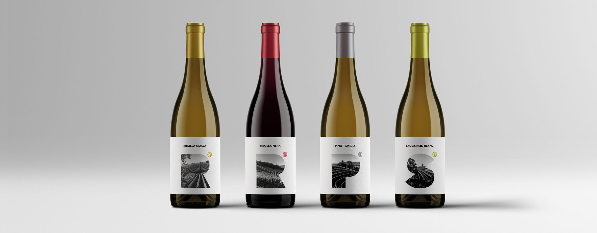
TheFont designed the labels following a deliberate choice to highlight and ennoble the territory of origin, the variety of grape selected and the final product. By carefully selecting the typography and incorporating the initials of the varietal used, “windows” were created that photographically depict the vineyards of origin.
To reinforce the notion of the terroir’s uniqueness — which lies at the origin of these wines — a playful graphic element was added based on the registered trademark symbol, substituting the letters G, N, G, B for the traditional © and ®.
The letters themselves can be traced back to the varietal from which the wine is produced: G stands for Grigio, N for Noir in the case of Pinot, G for Gialla in the case of Ribolla, and B for Blanc in the case of Sauvignon.


