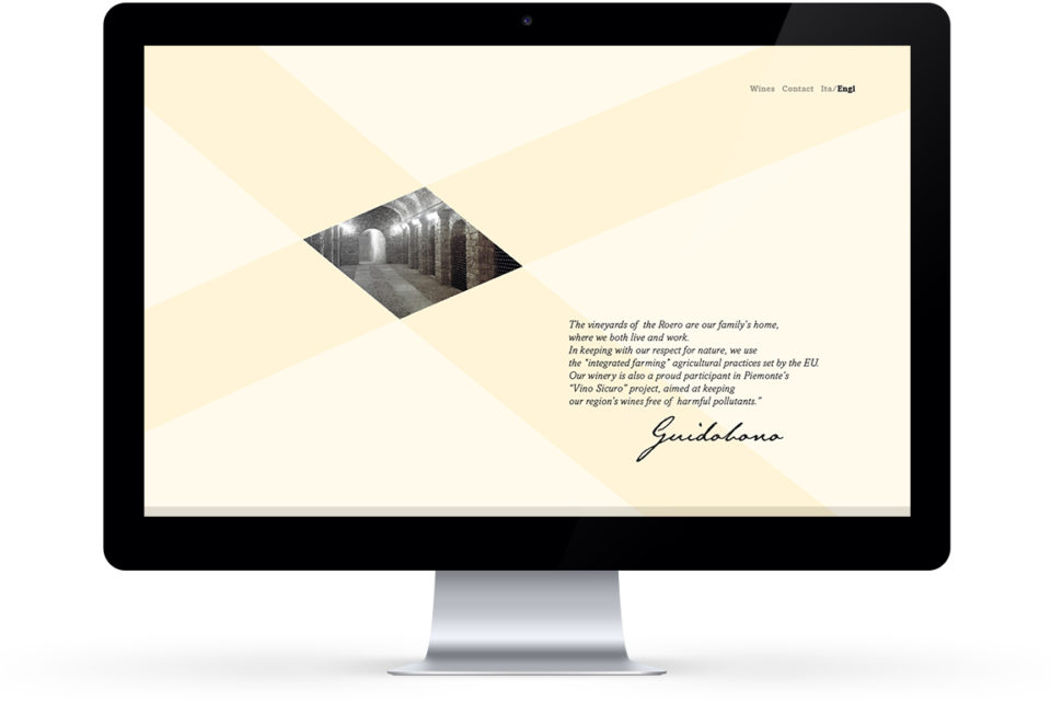
A family winery united over the generations by the same passion: producing wine. The visual identity needed a brand personality that would turn the company into a brand.
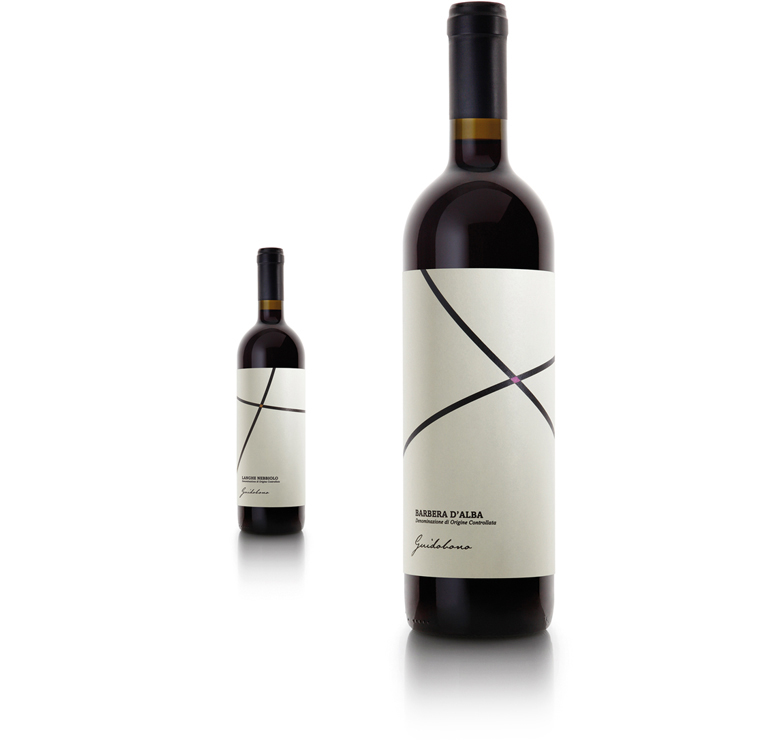
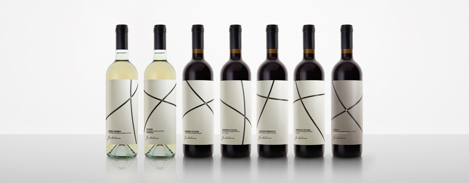
TheFont created two lines that intersect at the site of a crossing, a “place” simultaneously both graphic and conceptual aspiring to symbolise the generational bond between grandmother Velia (the vineyard’s first owner) and her children who have carried on the business; as well as the meeting point between the dedication of her grandchildren — both winemakers — and the generosity of extraordinary regions such as Roero, Langhe, Barolo.
Guidobono wines emerge from this “intersection” of lives, affections, people and territories.
